How to Create High-Impact Social Media Graphics on a Budget
Creating social media graphics that look professional doesn’t have to require expensive tools or a design degree. With a bit of structure, free resources, and smart shortcuts, you can consistently produce high-impact visuals even on a very tight budget.
Below is a practical, step‑by‑step approach you can follow.
1. Start With a Clear Goal for Each Graphic
Before you open any design tool, answer three questions:
- What is the purpose?
- Drive clicks? (e.g., “Read the full article”)
- Generate engagement? (likes, shares, comments)
- Build brand awareness? (logo recognition, consistent style)
- Who is this for?
- Age, interests, pain points
- What problems do they want to solve?
- What kind of visuals resonate with them? (clean/modern, playful, bold, minimal)
- What is the one key message?
If someone glances at your graphic for 2 seconds, what should they understand?- A benefit: “Grow your email list in 7 days”
- A hook: “Stop making this Instagram mistake”
- A clear offer: “Free webinar on Friday”
You don’t need a complex brief. One sentence is enough:
“Square graphic for Instagram to promote blog post about saving time with templates; aim: clicks + saves.”
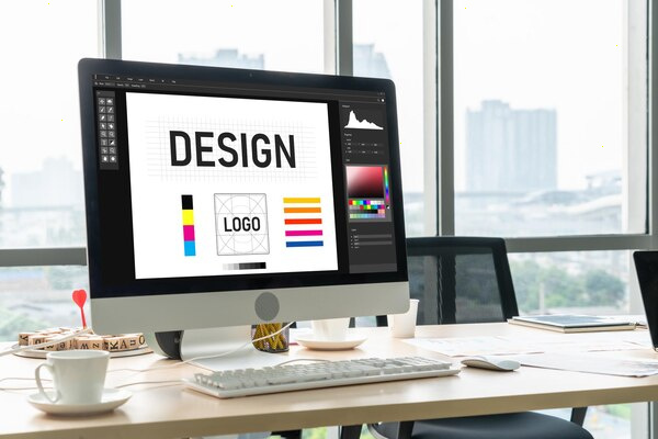
2. Choose the Right Free (or Very Cheap) Tools
You don’t need Adobe Creative Cloud to create strong visuals. Use tools that are:
- Easy to learn
- Template‑based
- Web‑based (no install needed)
Great free or freemium options:
- Canva – The most beginner‑friendly. Thousands of templates, fonts, and elements.
- Adobe Express – Good templates and brand features; integrates with Adobe ecosystem.
- VistaCreate (Crello) – Similar to Canva with many ready‑made animated designs.
- Figma (free tier) – Better if you think in terms of systems and want reusable components.
Pick one and learn it well instead of jumping between many tools.
3. Use the Right Size and Format for Each Platform
Using proper dimensions makes your design feel “native” to the platform and improves how it appears in feeds.
Common formats (you can choose the matching template in your tool):
- Instagram feed: 1080 × 1080 (square) or 1080 × 1350 (portrait)
- Instagram Stories / Reels cover: 1080 × 1920 (vertical)
- Facebook feed: 1080 × 1350 or 1200 × 630
- LinkedIn feed: 1080 × 1080 or 1200 × 1350
- Pinterest: 1000 × 1500 (vertical is crucial)
- X (Twitter): 1600 × 900 or 1200 × 675
Most design tools have these as presets, so you rarely need to remember the exact numbers—just select the correct template (e.g. “Instagram Post”).
4. Build a Simple, Consistent Brand Kit
Consistency does more for perceived quality than fancy design tricks. Even very basic graphics look “premium” when they clearly belong to the same brand.
4.1. Pick 2–3 Brand Colors
- One primary color (used most often)
- One accent color (for buttons, highlights)
- One neutral color (black, white, or a gray)
How to choose on a budget:
- Use free tools: Coolors, Adobe Color, or Canva’s color palettes.
- Aim for good contrast between text and background (test with a contrast checker if possible).
4.2. Choose 1–2 Fonts
You don’t need more than that.
- Headline font: Bold, easy to read, strong personality (e.g., a sans‑serif like Montserrat, Poppins, or Open Sans).
- Body font: Simple, extremely readable (you can even reuse the headline font in a lighter weight).
Make sure your fonts work well at small sizes on mobile screens.
4.3. Set a Few Simple Rules
Write down a tiny “brand rule” note for yourself, for example:
- Headlines: All caps, bold, in primary color
- Backgrounds: Mostly light; accent color only for emphasis
- Logo placement: Bottom‑right corner, always the same size
- Use accent color only for call‑to‑action (CTA) buttons or key words
Most design tools allow you to create a Brand Kit and save colors, logos, and fonts—use that to save time.
5. Use Templates as Your Shortcut
Templates are your best friend when you’re on a budget and short on time.
5.1. Find Templates That Fit Your Brand
- Search inside your design tool for:
- “Instagram quote template”
- “Podcast cover template”
- “Carousel post”
- Look for templates that:
- Use simple layouts
- Are easy to customize
- Don’t rely on premium images you can’t access
Start with 3–5 templates you can reuse instead of creating everything from scratch.
5.2. Create Reusable Post Types
Think in content formats you repeat:
- Quote graphics
- Tips / how‑to steps
- Before/after transformation
- Myth vs. fact
- List of 3–5 things
- Promotional / announcement posts
Design one template for each type and keep reusing them with new content. This:
- Saves a massive amount of time
- Trains your audience to recognize and understand your posts quickly
6. Keep Layout and Typography Extremely Simple
Simple layouts almost always perform better and look more professional, especially for non‑designers.
6.1. Use Clear Hierarchy
Your design should have:
- One main focal point – usually the headline or central image
- Secondary text – brief context or supporting details
- Optional small text – username, URL, or a short note
Make the main element much more visually dominant (larger, bolder, more contrast).
6.2. Limits to Keep You Safe
To prevent clutter:
- Fonts: Max 2 fonts (one can have multiple weights if needed)
- Colors: 2–3 main colors per graphic
- Text amount:
- Aim for 5–10 words in your main headline
- Leave heavy explanations to the caption or a carousel slide
White space is your friend. Don’t feel obligated to fill every area.
7. Use Free Images, Icons, and Illustrations Legally
You can make your graphics feel more polished with supporting visuals, even on a zero budget.
7.1. Free Stock Photo Sites
- Unsplash
- Pexels
- Pixabay
Tips:
- Choose photos that match your audience and topic.
- Avoid overly “stocky” images (fake smiles, unnatural poses).
- Prefer photos with a single subject and simple backgrounds.
7.2. Free Illustrations and Icons
Many design tools include free elements. You can also use:
- unDraw (illustrations)
- ManyPixels (illustrations)
- Flaticon or The Noun Project (icons, check license terms)
Always check whether attribution is required and whether commercial use is allowed if you’re promoting a business.
8. Craft Strong, Short, Scroll‑Stopping Text
Eye‑catching graphics start with strong copy.
8.1. Use Benefit‑Oriented Headlines
Focus on the outcome for your audience:
- Instead of: “Our new planner is here”
Use: “Plan your week in 10 minutes with this free template”
- Instead of: “How I use social media”
Use: “The 3 posts that bring me 80% of my clients”
8.2. Make It Easy to Read at a Glance
- Use large font sizes for headlines.
- Break long phrases into two lines or more.
- Highlight key words in your accent color or bold.
If you can’t read everything comfortably on a small phone screen, it’s too small or too long.
9. Adapt One Design Across Multiple Platforms
To save time and money, design once and repurpose.
Example: You create one square Instagram graphic with a tip.
You can then:
- Resize it to a vertical format and turn it into a Story.
- Add extra steps and make it a carousel on LinkedIn.
- Use the same design background, change the text, and post it on X.
- Turn the tip into a short vertical video (with the same colors and fonts).
Most design tools have a “Resize” option—this is one of the best time‑savers when you’re on a budget.
10. Use Analytics to See What Actually Works
High‑impact graphics are not just pretty—they perform well. You need to know which ones are working.
Look at:
- Engagement: likes, comments, shares, saves, reposts
- Clicks: link clicks for posts with CTAs
- Reach: do certain designs get shared more?
Patterns to watch:
- Which color backgrounds get more interaction?
- Do text‑only posts or image‑plus‑text posts perform better?
- Which post types (quotes, carousels, before/after) get the best saves or shares?
Keep the winners and gradually eliminate the formats that don’t perform.
11. Create a Simple Workflow to Save Time
Consistency matters more than perfection. A straightforward, repeatable process helps you show up regularly.
Example weekly workflow:
- Batch ideas (30–45 minutes):
- List 10–15 content ideas based on FAQs, comments, and popular posts.
- Write text (30 minutes):
- Turn those ideas into short headlines and minimal supporting text.
- Design in batches (60–90 minutes):
- Open your templates and create 5–10 graphics in one sitting.
- Schedule posts (30 minutes):
- Use native schedulers or free tools (like Meta Business Suite or Buffer’s free plan).
Working in batches reduces context‑switching and gets you better quality in less time.
12. When and Where It’s Worth Spending a Little
Even on a tight budget, a small, strategic spend can significantly upgrade your visuals:
- Remove background tools (often built into Canva/Adobe Express Pro)
- A short brand kit consultation with a designer to finalize colors and fonts
- A small stock photo subscription if you need a lot of very specific images
- A few premium templates that match your brand style
You can start free, then invest only in what clearly saves you time or lifts your professional look.
13. Quick Checklist Before You Publish
Run each graphic through this minimal checklist:
- Is the main message clear in 2–3 seconds?
- Is the text readable on mobile (size + contrast)?
- Is the design consistent with your brand colors and fonts?
- Is there one focal point, not three competing elements?
- Does it have a logical next step or CTA (read, comment, share, save, click)?
If you can say “yes” to most of these, you’re ready to post.
By combining simple brand rules, free tools, and a small set of reusable templates, you can produce social media graphics that look polished, perform well, and cost almost nothing. Over time, your visuals will feel more refined—not because you bought expensive software, but because you made smart, consistent design choices that match your audience and your goals.